m.cancer.gov
Goal: Design and launch the first mobile website for the National Cancer Institute within six months
My Role: UX Lead/Information Architect (Consultant)
My Team: Technical lead and visual designer
Customer Problem: NCI needed a mobile version of their site, but much of their content lacked structure and was too long for mobile views.
Successful Results: Four months after launch, mobile traffic had increased 122 percent. Government Computer News listed the site as one of their top ten Federal mobile “apps.”

m.cancer.gov home page
The National Cancer Institute, a division of the National Institutes of Health, is the U.S. government’s principal agency for cancer research. Cancer.gov, NCI’s official website, receives nearly three million visits each month from people searching for accurate, up-to-date, and comprehensive cancer information.
A technical architect and I were tasked with leading the design and development of NCI's first mobile website, working closely with a team of client stakeholders.
Challenges
Share content between sites in the Percussion content management system for the first time
Design a site that is almost entirely bilingual (English/Spanish) to reach underserved Spanish-speaking populations that rely heavily on mobile phones for Internet access
Add structure and standards to content to ensure that it would display properly on both the desktop and mobile sites
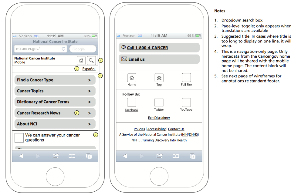
Annotated home page wireframe
Process
Reviewed site analytics and previous user research to determine which information was most popular and best optimized for search
Used those analytics to prioritize patients and caregivers as target audiences in the first release
Reviewed content types to determine which items would display best on mobile and were available in Spanish
Usability-tested the site in multiple iterations with our target audiences
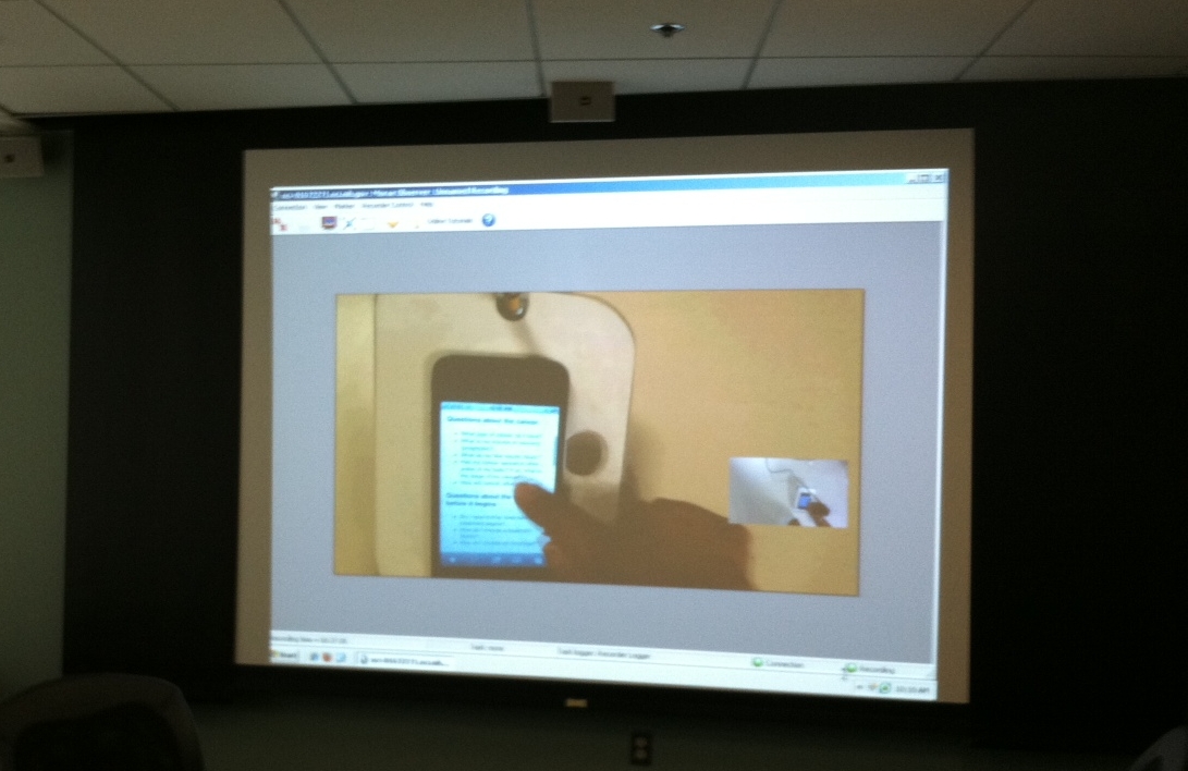
Scene from the observation room during a usability test


Results
The site provided comprehensive cancer information in a simple interface. Users could find information about treatments for almost 100 types of cancer, as well as more general information about coping and side effects; the Dictionary of Cancer Terms; cancer research news; and information about NCI. With one click users could call or email a cancer information specialist. All content could be easily shared via email or social networks, and each page contained links to NCI’s other online channels: the full Cancer.gov site, Facebook, Twitter, and YouTube.
“This tool is a helpful one I wish had been available when my late father was battling cancer. It might have made us better prepared for the pitfalls along the way…It well deserves a usefulness rating of 10.”
Four months after launch, mobile traffic had increased 122 percent, with 236,286 mobile phone visits in July 2012. Government Computer News listed m.cancer.gov as one of the top ten Federal mobile apps that June.
“Dear NCI, today was my first time using mobile cancer.gov. Really like this!! Very easy to navigate on my phone!! Great use of Federal resources!”