U.S. Citizenship and Immigration Services: Beacon Design System
Goal: Create a Unified Design Language for ELIS
My Role: Product Design Lead and Program Manager (Consultant)
My Team: 12 product designers/user researchers, a content strategist, and a creative project manager
Customer Problem: Address inconsistent UIs and code in ELIS
Successful Result: A more consistent ELIS UI and faster design and development processes
The ELIS system was built in 2011 using a rudimentary design system, but standards had degraded over time. When our team conducted a UI inventory in 2017, we found more than 50 variations of gray, and 20 different button styles, sometimes in the same form. In addition, developers were requesting standards from the design team as the current implementation was so poorly defined. Their standard operating process was to copy code from existing pages in the system, leading to additional UX and technical debt.
Our inventory of the colors in ELIS before and after creation of the Beacon Design System
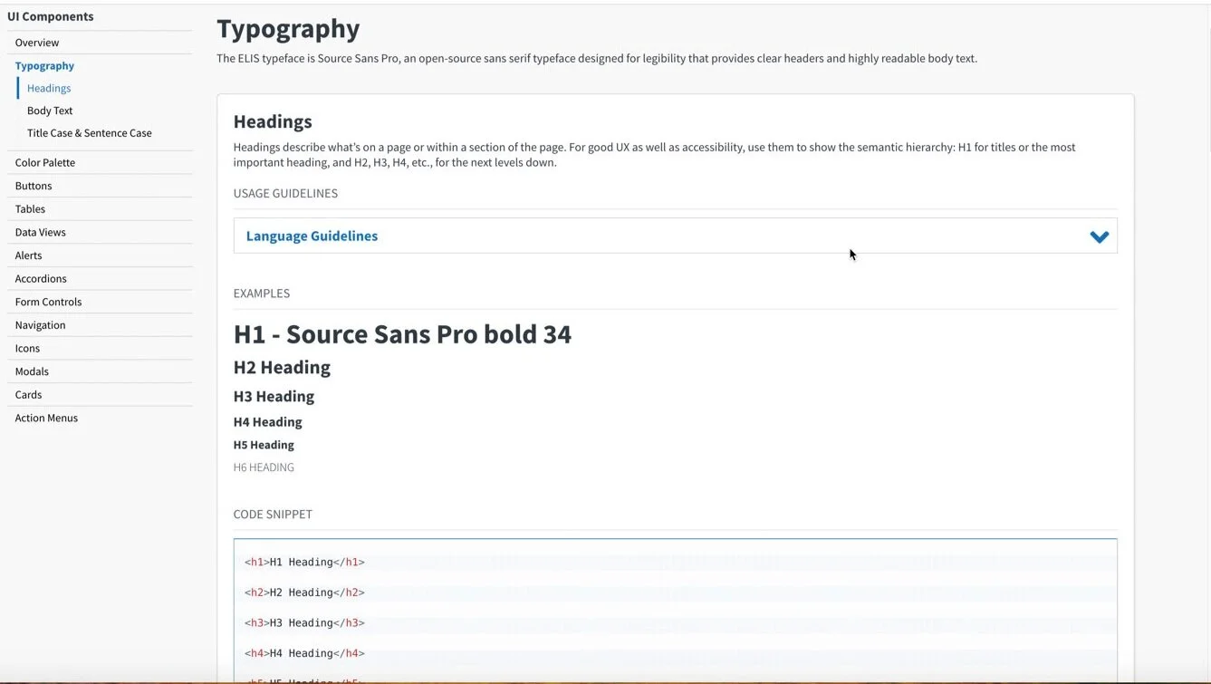
A page from the Beacon Developer Guide
To address this problem we created a new design system, called Beacon. This was based on the U.S. Web Design Standards but modified to integrate visually with existing ELIS screens and provide more interactive components. Initially, delivery teams and leadership were risk-averse to trying this system in their new projects. It was not until a delivery team volunteered to build and support Beacon that we were able to move forward. Now all new development is created in Beacon and the team’s prototyping tools reference the Beacon library. A Beacon Developer Guide was created in GitHub for the AngularJS code base. The Beacon developer guide contains code snippets, recommended use cases and accessibility and language guidelines. The UI components meet accessibility requirements and contain built-in user analytics tracking.
Challenges
Initially, delivery teams would not agree to use the design system as it would push out their timelines, which was part of their team assessments. It required a trial run on a project, with dedicated support from our development partners, before the client mandated that teams develop in Beacon for all new UIs in ELIS.
Just as we were reaching a baseline level of design system maturity, the client pulled the team who had built and supported Beacon, as they were needed on new product development. The client wanted all 26 delivery teams to own Beacon. In reality, this meant that no one would own it.
Because the original code base was so inconsistent, we could not automatically convert all older UIs to the new design system. The code had to be converted component by component across forms and this work was not prioritized for existing functionality.
Process
I persuaded the client to stand up a Beacon Working Group, with representatives from the design team, all delivery contractors and USCIS, to ensure that updates to standards were addressed in a systematic manner. This group also provided technical support for the delivery teams. Design system updates were approved by all ELIS product owners.
Results
Beacon has introduced consistency to new product design and development. Designers use a shared library in the prototyping tool and developers use the code base. The UI elements have been usability-tested and ensure adherence with accessibility standards and Matomo analytics tracking.
Current State
As AngularJS reached end of life, the Beacon Design System was rebuilt in React, using Storybook for the new Developer Guide. The ELIS code base is in the process of being migrated to React. The design team is also preparing to migrate from Axure to Figma, which will impact designer-developer collaboration in the design system.